
blog > city super is doing everything it can to discourage customers from shopping online
City Super is doing everything it can to discourage customers from shopping online
28th of June 2018
That a company with the brand-recognition, prestige, and (presumably) budget of Hong Kong's esteemed posh supermarket, City Super, should have opted to use DIY-online-store-building platform, Shopify for their e-commerce website, surprised me - I'll be honest.
![]()
I have nothing against Shopify. Awon Golding's beautiful millinery website uses Shopify. Plenty of perfectly nice-looking e-commerce websites use Shopify. But Shopify tends to be what you use when you're testing out a new product (or a new market). It allows you to get your products up for sale fairly rapidly, and with minimal set-up costs. In return for this you pay some punchy ongoing and transaction costs, and your wings are somewhat clipped in terms of the features your website can include.
(It being a hosted system – it lives on their server not yours – if there isn't a plugin which meets your needs currently available in their limited 'ecosystem' then you're on your own. At the time of writing, for example, there isn't a properly-functioning multi-language option available to Shopify store owners. This may change, but the point remains: your website's features are tied to someone else's feature-set. And naturally they make it difficult to export your data when you grow out of them.
The alternative, that we'd recommend to anyone looking to build a future-proof website which will expand as their business grows, is to build a custom e-commerce application based on an open source platform. You – and of course I mean "we" – can then build whatever features you can dream up. Get in touch..!)
So I wasn't expecting the website to be anything special, but it did still shock me quite how much of a, well, car crash, the City Super website manages to be.

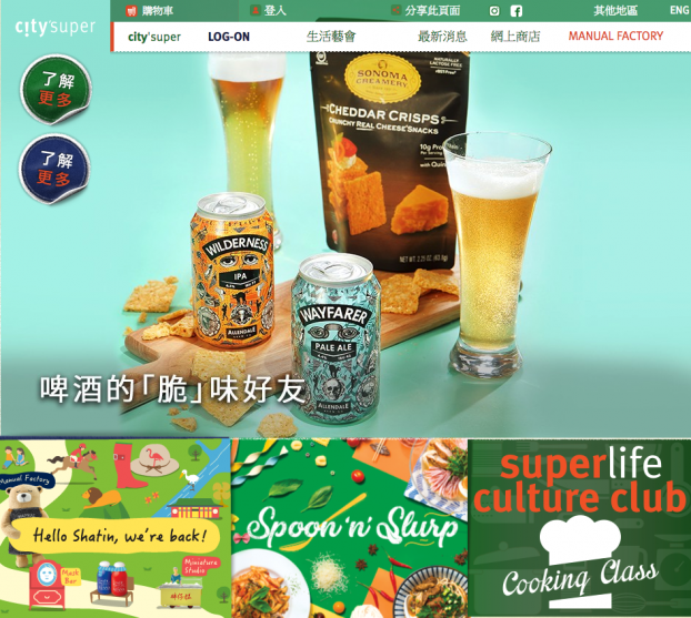
Even once you get past the 1990s-style landing page (above) – and somehow, eventually, deduce that “LOG-ON” is a brand name, not a verb – it feels like a bizarre relic from a troubled past.
A high-end supermarket website should make you feel as a high-end supermarket does: that you have wandered into an abundant oasis of beautifully-presented and lavish food and drink, that everything you see is either 'healthy' (ie. boring) or 'indulgent' (ie. unhealthy), and that your status as a human will be ineffably elevated by supressing impulse-control and allowing your greedy subconscious to gorge on as much of this smorgasbord as it can. The City Super website (unlike City Super itself, which I quite like) makes me want to both stop buying food and stop using websites.

For some reason they've seen fit to repeat the preposterous Sistema plugline “The Magic of Tidying Up” (doesn't anyone read this stuff before it goes out?) three times on the same page. And what in God's name is an “Avocado Hack” when it's at home? It's the certain indicator of a doomed civilisation spiralling toward a fiery apocalypse, that's what it is. You can't even blame this stuff on dodgy translations, remember this website is English only (thanks again, Shopify).
This, I guess, is their attempt at content marketing (and it may well work: I can't exactly imagine Wellcome doing it any better). But the dreary low-rent monotony of their copy is nothing compared to the design clangers strewn around the site.
First simply compare City Super with Waitrose (a similarly high-end UK supermarket) or even boring old Tesco. In that company, City Super is clearly an amateur.
The online store (they call it an E-SHOP - who does that?) is not present at the citysuper.com.hk home page, you have to click through to it from another page mostly given over to more of "The Magic of Tidying Up" (the margins on tupperware must be incredible). Once you get to the online store itself, the home page is a dominated by a dreadful image carousel:
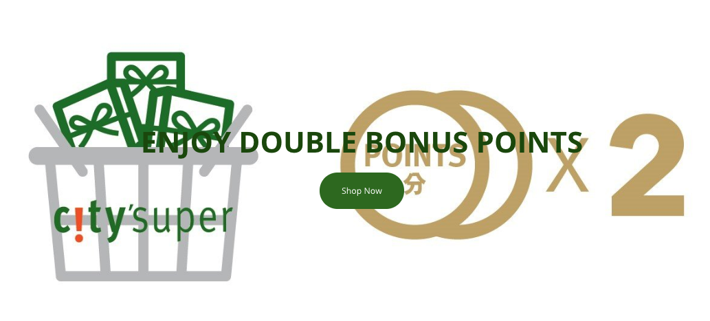
(Why "Shop Now"? I am shopping! Or trying to.)
A friend told me recently that taxonomy is the most important aspect of information technology. Give everything a logical name, and everything good will follow smoothly from that. With that in mind let's examine their main navigation:
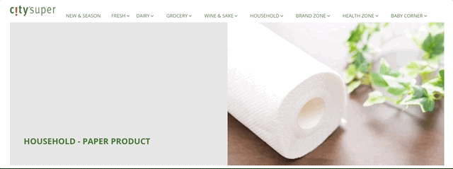
So ignoring "New & Season" (which could be anything) you get to "Fresh", "Dairy" and "Grocery" - categories with significant conceptual overlap, which causes confusion, delays users in acheiving their shopping goals, and increases the chance precious site-visitors will change their mind and go bash their heads with rocks instead. So isn't the dairy stuff also fresh? Is a carrot fresh or is it a grocery? The most rudimentary usability study would have highlighted all of these issues and more, all of which should have been ironed out at the wireframing stage soon after the start of the design project.
Clicking the categories in their dropdown menu creates further confusion. Some of the top level item point to categories, some point to subcategories. The lack of breadcrumb navigation means you can't easily find your way back a step, you have to give up and start again. I can say without hyperbole that this website makes me want to cry.
The search function is barely any better. Search results are shown in a grid which looks different to the category page. Hovering over a product in the search results shows an "add to cart" link, while the same action in the category view shows a bizarre "quick shop" link, which leads to a popup designed to give you quick access to a summary of information. The product page shows a "buy now" button when they mean "add to cart" (it's a subtle difference, but a crucial one). When you finally get there, they have managed to make their checkout harder to use and less intuitive than Shopify's out-of-the-box checkout. Simply clicking "checkout" from the cart page throws an error asking users to enter a valid zipcode – which as we know is anathema to any Hong Kong resident.
In summary, come on City Super, you can do better than this. With the prices you charge for your food you really ought to be able to manage a decent website! Our contact details are below if you'd like to have a little chat.